
'Went to Edward Tufte's remarkable experimental two-day seminar last week in P'Alto. He covered most chapters of all four of his books in depth, with many delightful stories, insights and examples. Also the story of how he came to self-publish the books. And he included "office hours" segments to answer individual questions.
I came with away these main points:
- In reference to pie charts, et al: "Graphics can do more than present the obvious to idiots."
- One must be true to the data and do whatever it takes to present the data in the clearest way possible.
- People tend to get stuck in the assumed limitations and cliches of a given medium, and one might have to use one's creativity to break free of that for a better presentation of the data.
- Presentations should serve the data and not the medium.
- Clarity comes from more information, not less.
- It's possible to pack an awful lot more information in a presentation than you'd expect.
ET brought in and displayed several rare first editions of books by Galileo, Euclid and others, which clearly proved how data visualization can break free of the most primitive presentation technologies. (And then you can compare that to PowerPoint.)
Linkies:
Edward Tufte's web site: edwardtufte.com
The always fascinating Ask ET Forum
The books:
All are highly recommended, especially the books.
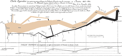
(The image above is bad copy of Charles Joseph Minard's map of Napoleon's March to Moscow, which has sort of become ET's icon.)
Post a comment
Thanks for signing in, . Now you can comment. (sign out)
(If you haven't left a comment here before, you may need to be approved by the site owner before your comment will appear. Until then, it won't appear on the entry. Thanks for waiting.)